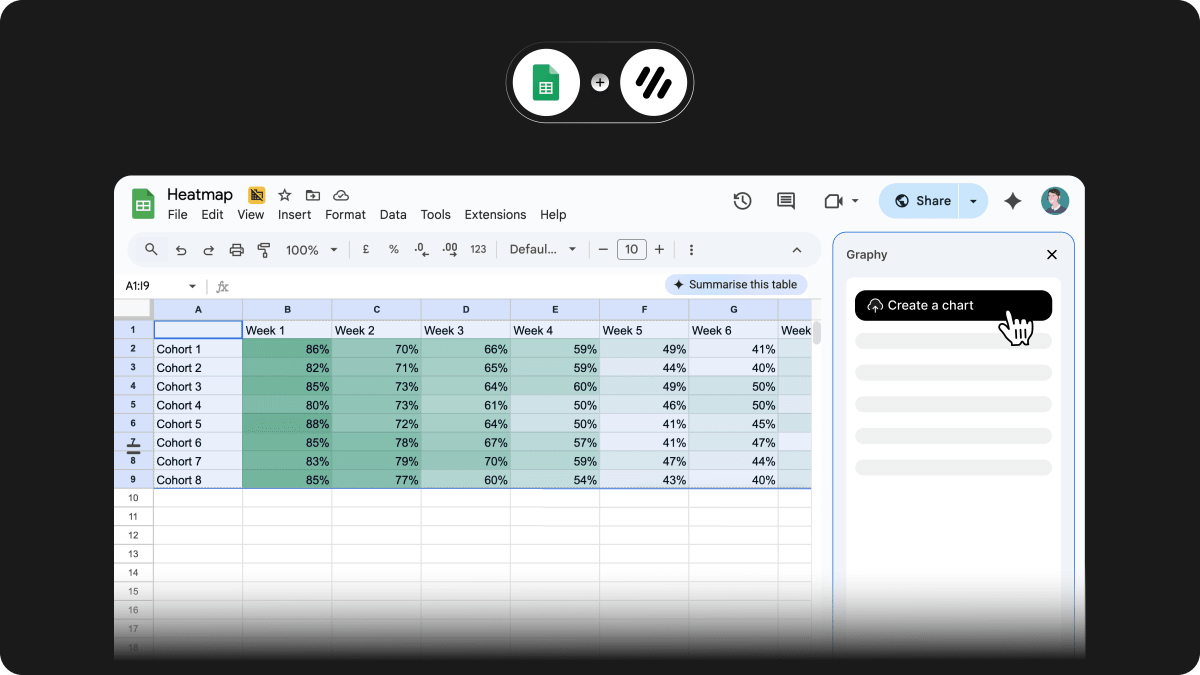
Powered by Cycle
Powered by Cycle
Hero image

Google Slides extension

No more back and forth between Graphy and your presentation. Our new Google Slides extension makes it easier to bring your charts into presentations and keep them up to date.

Here’s how it works:

  1. Add charts directly in Slides – search and insert charts from your Graphy workspace without ever leaving your presentation.

  2. Refresh charts with one click – your charts stay linked to their source in Graphy, so when the data changes, your slides stay in sync.

This is perfect for:

  • Regular reporting decks that evolve over time

  • Consulting deliverables where data updates at the last minute

  • Team presentations where multiple people contribute charts

Available now for all users, simply install the extension here.

Smarter pie charts, clearer stories

We’ve revamped how pie and donut charts work so you can highlight the parts that matter most.

Here’s what’s new:

  • Highlight slices – Emphasize key parts of your pie chart with subtle visual focus.

  • Layout presets – Choose from three layouts: classic with legend, centre-aligned headline, or a clean, minimal view.

  • More control – Move legends to the side, center headline metrics in the donut hole or above, and add category + value labels to each slice.

This is perfect for:

  • Showing share of total without overwhelming the viewer

  • Making one slice stand out in a crowded pie

  • Cleaner layouts for KPI-style dashboards

Available now for all users.

• You can now adjust the thickness of lines on line charts to better match your visual style.
• Tooltips now always include the x-axis value for added clarity.
• You can now choose to hide the overall conversion rate in funnel charts when it’s not the focus.

Pitch.com

Pitch + Graphy: Where your data becomes part of the narrative.

This is one of those collabs that just feels right.

We’ve always been huge fans of Pitch, and we've always believed that magic happens when standout presentations meet powerful, interactive charts.

Why it works:
📊 Graphy charts are fully interactive inside Pitch
🔁 They stay live — update a chart, & your Pitch slide updates automatically
🎨 They look like they belong — seamless design, smooth integration

Better data storytelling, right where decisions happen.

Changelog 01/05

Graphy just got a visual refresh. As we’ve added more power and flexibility, things were starting to feel a bit heavy, so we took a step back and streamlined the experience.

The new design makes it easier to focus, faster to build, and smoother to navigate, without losing any of the capability you rely on.

Plus, the new look is all set up for some big changes coming soon.

Here’s what’s new:
• A cleaner chart editing view, with a collapsible chart toolbar
• A redesigned Edit Data view that makes it much easier to add or update data
• A tuck-away left-hand navigation bar for more space when you need it
• A new chart toolbar with clearer, more intuitive buckets

Clean look. Same Graphy power.

Changelog 04/04

We’ve added new background options to help your charts feel right at home—no matter the theme or context. Choose from:

  • Default: adapts automatically to light or dark mode

  • Grey: a balanced neutral that works across palettes

  • Tint: soft color overlays that complement your palette

  • Custom: pick any background color you like

  • Transparent: no background at all—ideal for layered layouts

Whether you're building presentations slides or embedding into Notion, it's now easier to match your chart backgrounds to your story.

  • Chart annotations are now editable for easier updates.

  • Text toolbars now match the style of other editing panels.

  • Transparent backgrounds now support borders for cleaner exports.

  • Averages now include legend labels to clarify which series they belong to.

Changelog 19/03

Accidentally deleted a chart? No worries. With our new restore feature, Business tier users can quickly recover deleted charts without losing their work.

Simply open the deletion menu and choose to restore or permanently delete the chart. Stay in control of your visualizations with effortless recovery options.

  • If you refresh using Google Sheets with "My data is in rows" selected, your setting will now persist.

  • Enhanced arrows and annotations for better clarity and usability.

    • Improved dark & light mode colors by introducing a refined gray alongside black and white, depending on the theme.

    • Sticker mode is now off by default for a cleaner initial experience.

  • Downloaded chart filenames now match the chart name in Graphy for better organization.

Changelog 12/03

Your notes on charts just got a style upgrade! 🎨 We've added Permanent Marker and Fineliner fonts so you can annotate with more personality.

Whether you want a bold, handwritten feel or a sleek technical touch, you now have more ways to make your insights stand out.

We’ve made number formatting more flexible!

Now you can set decimal places to fixed or automatic, with improved auto mode for better precision. Plus, you can choose whether to abbreviate large numbers.

Whether you need exact values or a cleaner look, it’s all in your control.

Changelog 05/03

Now you have even more flexibility with your charts! 📊 Choose whether to show the Y-axis, set its position, and decide if it should start from zero. These small refinements help you display your data exactly how you need it. 🚀

  • We will remember if your data was set to "My data is in rows" when you refresh data via Google Sheets.

  • Fixed some bugs that make our font toolbar much more reliable.

  • Fixed the chart wheel (when you click on a data point) so that it doesn’t get cropped at the sides of the chart.

Changelog 30/01

Your text, your way. With the new Text Toolbar, you can customize fonts, sizes, and colors to fit your story. Choose from a variety of typefaces—Sans Serif, Serif, Graphy, Technical, or Handwritten—to match your style. Need emphasis? Adjust size and color to make key insights stand out.

Make your data stories clearer, more expressive, and uniquely yours.

  • Bug where text annotations would sit underneath arrows & couldn’t be read.

  • Made headline metric areas more responsive so they don’t become scrollable areas with scrollbars.

  • Continual tweaks to AI, lots more on this soon!

Changelog 23/01

Today marks the first milestone on our journey to revolutionize how you visualize data and tell stories. With AI Alpha, you can now create insights effortlessly using conversational AI.

Feedback wanted! 🙏
It’s still very much in it’s early phases and looking for your help to shape it! We’d love to hear how you find it and how to make it better!

Updates to the Members Section in Settings

Track Pending Invites: Easily see which team members you’ve invited and are still awaiting acceptance.

Shareable Invite Links: Copy the invite URL to share seamlessly across channels like Slack or Teams.

Changelog 12/11

You can now seatch for charts & boards across your team. You cand find this at the top of your sidebar or by hitting the faithly ‘cmd’ + ‘k’ (or ‘ctrl’ + ‘k’)

No need to select the ‘Export’ tab anymore, instead use ‘Copy image’ to quickly get a copy of the chart to share with others.

This will use your previous export settings too so that you know you you’re gunna get the right chart each time.

Changelog 28/10

📝 With our AI Insight writer, you can now refine your prompt to get the perfect caption.

Here's a few things you can now do:

- Specify what you're looking for, whether it's summarizing, asking a question, or making a decision.

- Add important context to make your caption more useful.

- Refine tone, length and structure based on who your audience is

Changelog 11/10

We spent some much-needed time cleaning a few things up after our Graphy AI launch last week.

  • 📏 improvements to increasing font sizes

  • 🔢 adjusted the ‘paste my data’ new chart flow, we now use some of our Graphy AI magic to help ensure you can visualise your data

  • 🧰 re-arranged and simplified the chart toolbar options in a board view

  • 🐛 fixed a bug with colours and hiding columns

  • 🐛 fixed a bug where our play mode was displaying the wrong colours

Announcing Graphy AI ✨

Creating graphs can be:
😔 Overwhelming
Time-consuming
😤 Complex, requiring specialized knowledge

As a result, no one invests time in creating graphs, leading to results that leave your audience unengaged and confused.

🚀 We're here to change that:
Graphy analyzes your data and suggests key graphs and insights in seconds.

Why try it today?
🪄 Automated Graphs
Graphy AI analyzes your data to recommend essential graphs. Easily connect data from Google Sheets, CSVs, or Excel.

Insightful Suggestions
For each graph, Graphy AI identifies key insights such as anomalies, trends, and spikes.

📖 Tell Your Story
After selecting your key insight, choose how to enhance your story.

Changelog 13/09

Create brand kits to save your company’s brand colours or your favourite colours, and instantly apply them to any chart.

These themes can also be used by other users in your team to ensure that everyone works with the same colors.

Changelog 06/09

Changelog 30/08

Difference arrows are a powerful way to highlight a specific change on a chart. Matching your chart colors, this is a great feature to combine with highlighting specific bars

You can now connect to data points to show:

  • an absolute difference

  • a percentage difference

  • a magnitude difference

Changelog 23/08

Without a doubt one of the biggest requests we heard. You can now import or connect your data from various places 🙌

Import data from:

  • CSVs

  • XLS (Excel files)

Or connect (refresh at any time) data from:

  • Google sheets

Announcing Graphy for Data Storytelling 🎊

Most graphs you encounter:

😔 are overwhelming,
😠 require unnecessary meetings to explain,
😤 and lack actionable insights.

As a result, everyone leaves with different opinions and contradictory beliefs about the next steps.

We’re on a mission to change this. Graphy enables anyone to become a skilled data storyteller, by radically simplifying how data is presented and communicated.

Why is this our most exciting release yet

🔗 Import data directly
From Google Sheets, CSVs, or Excel. You asked (a lot) so we’re super excited to be able to release this to y’all.

Graphy got a glow up
From a new UI to new chart types, our charts are now easier to make and more powerful.

📖 Craft your story
Communicate insights and focus attention on key data points with visual annotations and one-click enhancements such as goals and trend lines.