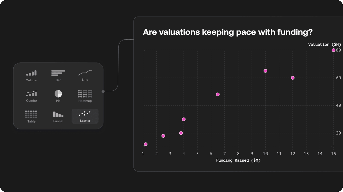
Now live: a new chart type that’s perfect for showing relationships between two variables — like revenue vs. retention, or time on page vs. conversion rate.
You can:
Add trendlines to highlight patterns and correlations
Adjust dot size for better readability and visual balance
Hover to see full detail for each data point
Scatterplots are ideal when you want to:
Spot outliers
Understand clusters
See correlations at a glance
Try them out now and as always, everything stays on-brand and easy to customise.