Introduction
Every day, thousands of professionals use Noona HQ in more than 20 countries worldwide. These professionals are primarily using four functionalities in Noona HQ:
The Calendar
The Sales Pro
The Client list
Reports
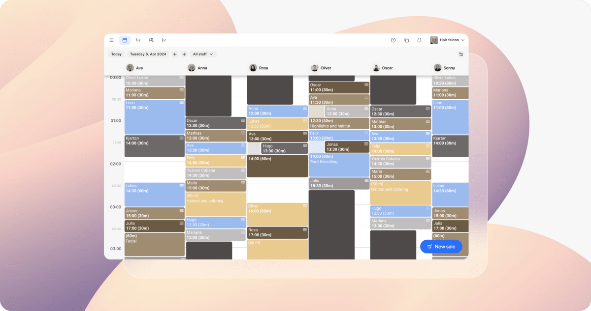
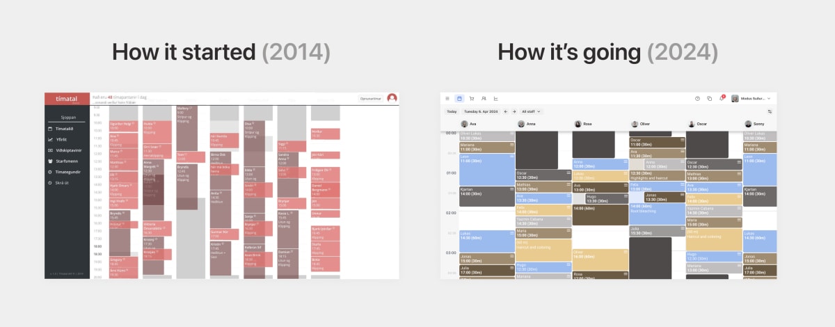
To highlight these four core functionalities in our system, we decided to improve the “Navigation Bar” so that it will be easier for our users to access the most essential parts of Noona HQ. By moving the “Navigation Bar” from the left side of the screen to the top, we are also creating more room so that Noona HQ feels cleaner and has more space on all horizontal screens, such as tablets, laptops, and other desktop computers.
The most important parts of the system will get their tab in the new navigation bar, but all other pages like Services, Staff, and Settings will be easily accessible through the Main Menu (≡).
What’s New?
The left-side navigation panel has been transformed into a collapsible menu, reclaiming screen space and improving calendar visibility.
Key features are now easily accessible via the top navigation, tailored to your industry for an intuitive experience.
A fresh, streamlined look for the top navigation bar, enhancing both functionality and aesthetics.
Why We Made This Change
With Noona HQ servicing more industry verticals, we needed a flexible, space-saving navigation to meet diverse user needs. This update enhances usability, improves first impressions for new customers, and aligns our platform with recent mobile navigation changes.
